The FactoryPMI Reporting plugin gives you the ability to create dynamic PDF reports in FactoryPMI. This guide steps you through creating a basic PDF report, using the FactoryPMI Reporting plugin, that contains a table and pie chart of downtime information.
Background
The FactoryPMI Reporting plugin makes creating professional reports easy with a rich library including: images, graphs, tables, barcodes, and a variety of basic shape tools. Access to reports is web based via the FactoryPMI runtime, a Java application, providing authenticated users access from anywhere, all based on networking standards that your IT department can support. Reports are printer friendly and can easily be exported to a variety of formats including PDF! Here are some common uses of dynamic reports:
- Production Management
- Efficiency Monitoring
- Downtime Tracking
- Statistical Process Control
- Quality Assurance
- Overall Equipment Effectiveness (OEE) Management
- Historical Data analysis
Introducing the Downtime Data
For this tutorial, all of the downtime information is stored in a single table called downtime.
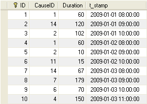
This table has four columns:
- ID - Primary Key
- CauseID - Foreign Key to Causes table, represents the reason for downtime
- Duration - The number of seconds for the downtime entry
- t_stamp - The timestamp of when the downtime started
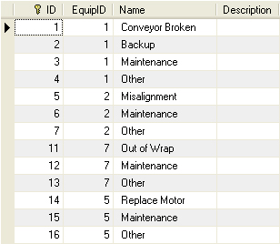
This table has four columns:
- ID - Primary Key
- EquipID - Foreign Key to Equipment table, represents which piece of equipment the cause is from
- Name - The name of the cause
- Description - The description of the cause
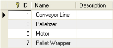
This table has three columns:
- ID - Primary Key
- Name - The name of the equipment
- Description - The description of the equipment
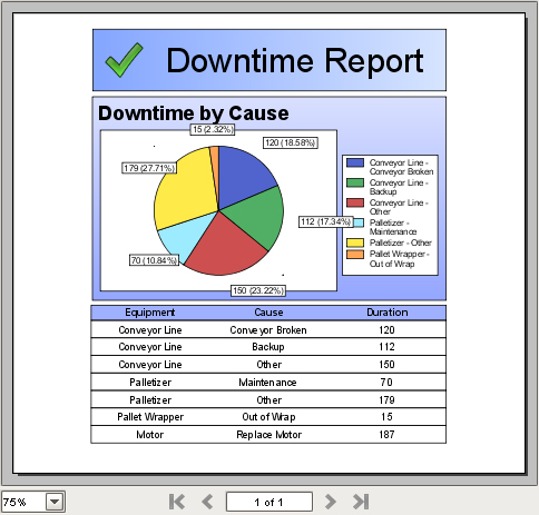
Final PDF Report
Here is an example of what the report will look like once you complete this tutorial.
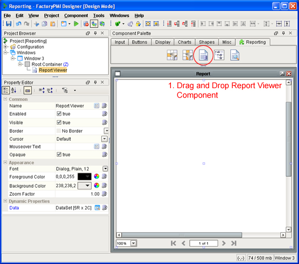
Step 1: Drag Report Viewer Component into Window
First, you need to drag and drop the Report Viewer component, from the Reporting tab in the component palette, into a FactoryPMI window.
Step 2: Retrieve Downtime Data
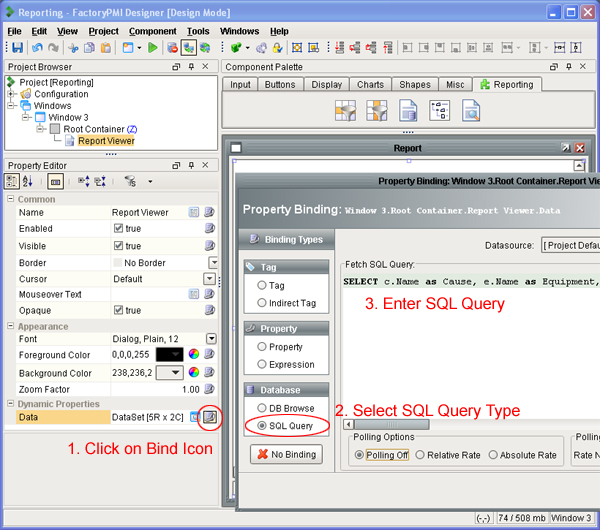
Next, we need to bring in the downtime data from the three tables mentioned above. To do this we need to bind the Data property to a SQL query.
Note: The Data property comes with the Report Viewer by default and it is a dataset. You can add/edit/remove these dynamic properties in the Report Designer.
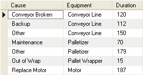
Here is an example SQL query that joins the three tables above and groups the data by cause:
SELECT c.Name as Cause, e.Name as Equipment, SUM(d.Duration) as Duration FROM downtime d JOIN causes c ON c.ID = d.CauseID JOIN equipment e ON e.ID = c.EquipID GROUP BY c.IDThe result of this query shows us the sum of the duration for each cause:
Next, click on the bind icon next to the Data property, select the SQL Query binding type, enter in the query above and press OK.
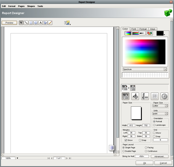
Step 3: Design Report
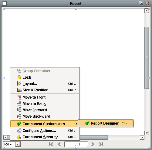
Now, we need to design the report using the downtime data. To do this, right click on the Report Viewer component and select Component Customizer -> Report Designer or press Control-U.
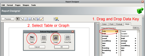
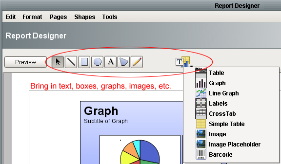
Here you can add labels, graphs, tables, images and more. Now that the Report Designer is open you will see the Data property in the Keys tab on the top right of the screen. We can easily drag and drop the Data property into the design space. We will get a dialog asking us what we want to make out of this property and we can select a Table or a Graph.
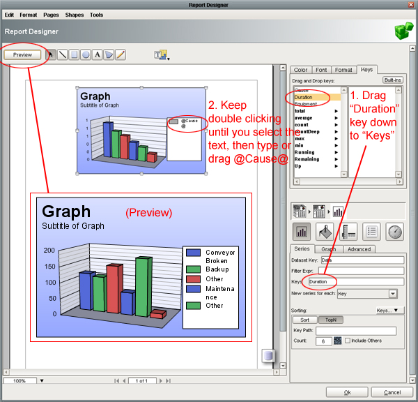
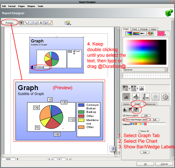
First, let's make the pie chart. Drag the Data key into the window and select Graph. Next, drag the Duration key into the Keys section on the graph. Lastly, keep double-clicking on the graph until you select the text, then type or drag @Cause@.
You have successfully displayed data from a database in a report. Now, we can change the graph to a pie chart and customize it further. When you select the graph component you will see a list of tabs and properties associated with it on the right-hand side of the designer. One such tab for the graph component is the Graph where you can select what type of graph to use, whether or not to show legends and bar/wedge labels, and set colors. Let's change the graph to a pie chart and show the bar/wedge labels by selecting the appropriate options.
Now, let's create a table. Drag the Data key into the window and select Table. Next, select the Header checkbox to have a table header. Lastly, drag the appropriate keys in the different cells of the table to bring in the data.
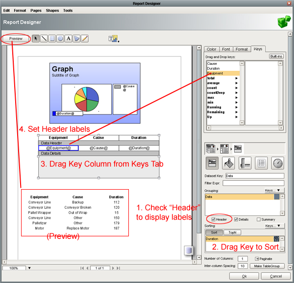
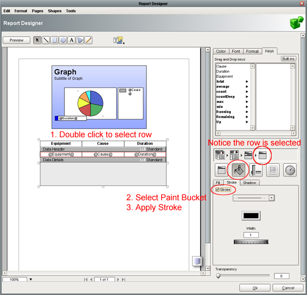
Again, we can customize the table further by changing any properties on the right-hand side like borders around each row. Double click in the table to select header or data rows. On the right-hand side select the paint bucket button. From there, select the Stroke tab and give the rows a stroke.
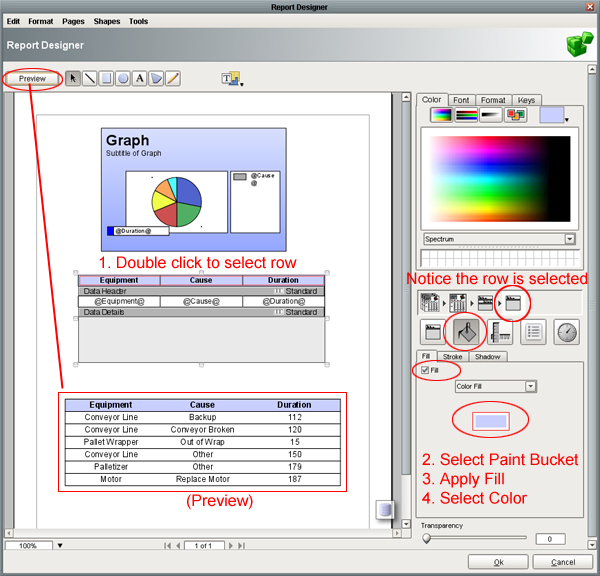
We can also give any row a color, for example the header row.
Now, we are showing a pie chart and a table. You can bring in any component into the report and change the properties to hook them up to data in the database or to tags.
That's it! We now have created a dynamic PDF report using our downtime data.
For any questions on the Reporting Plugin consult the forum, user manual or one of our tech support reps.